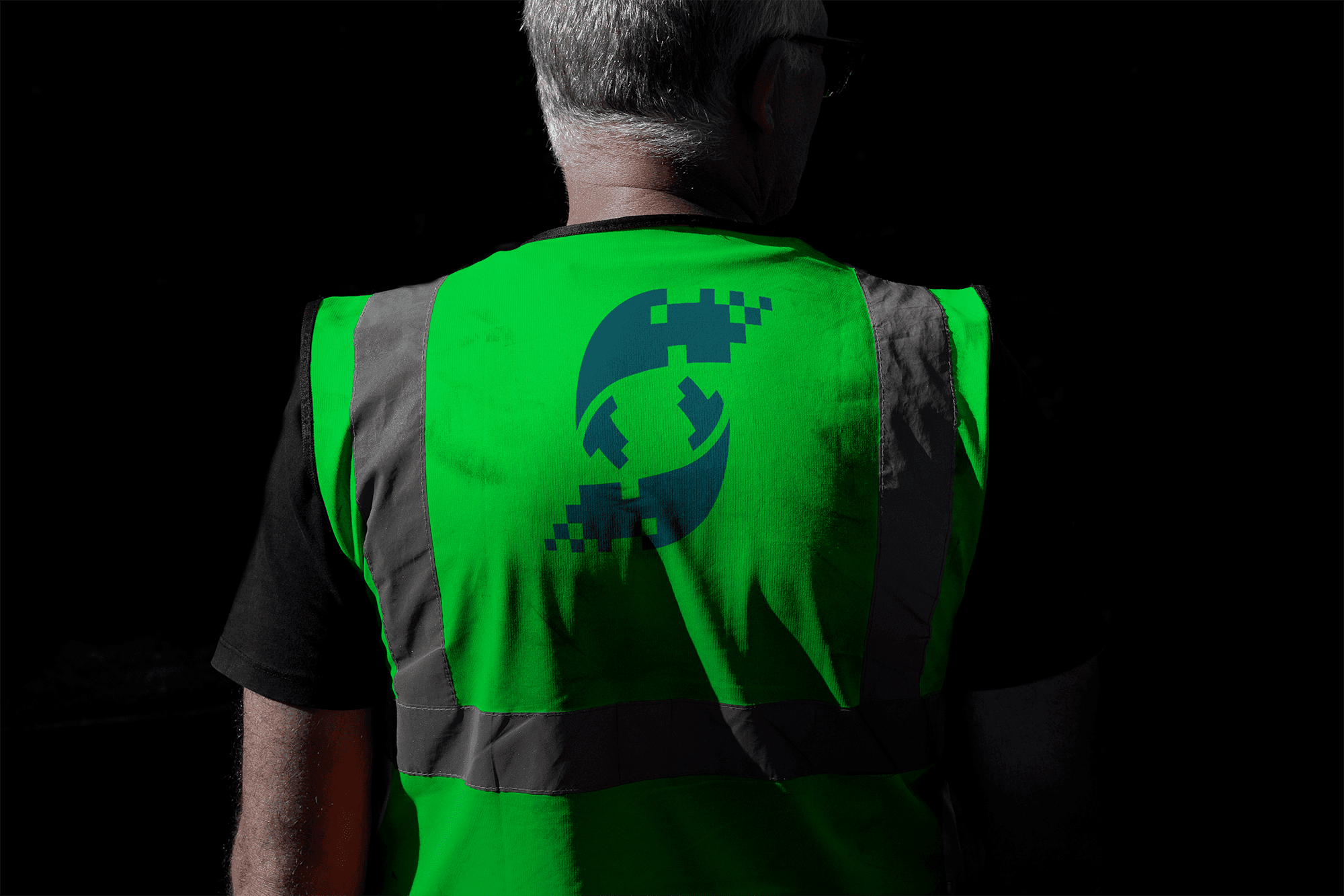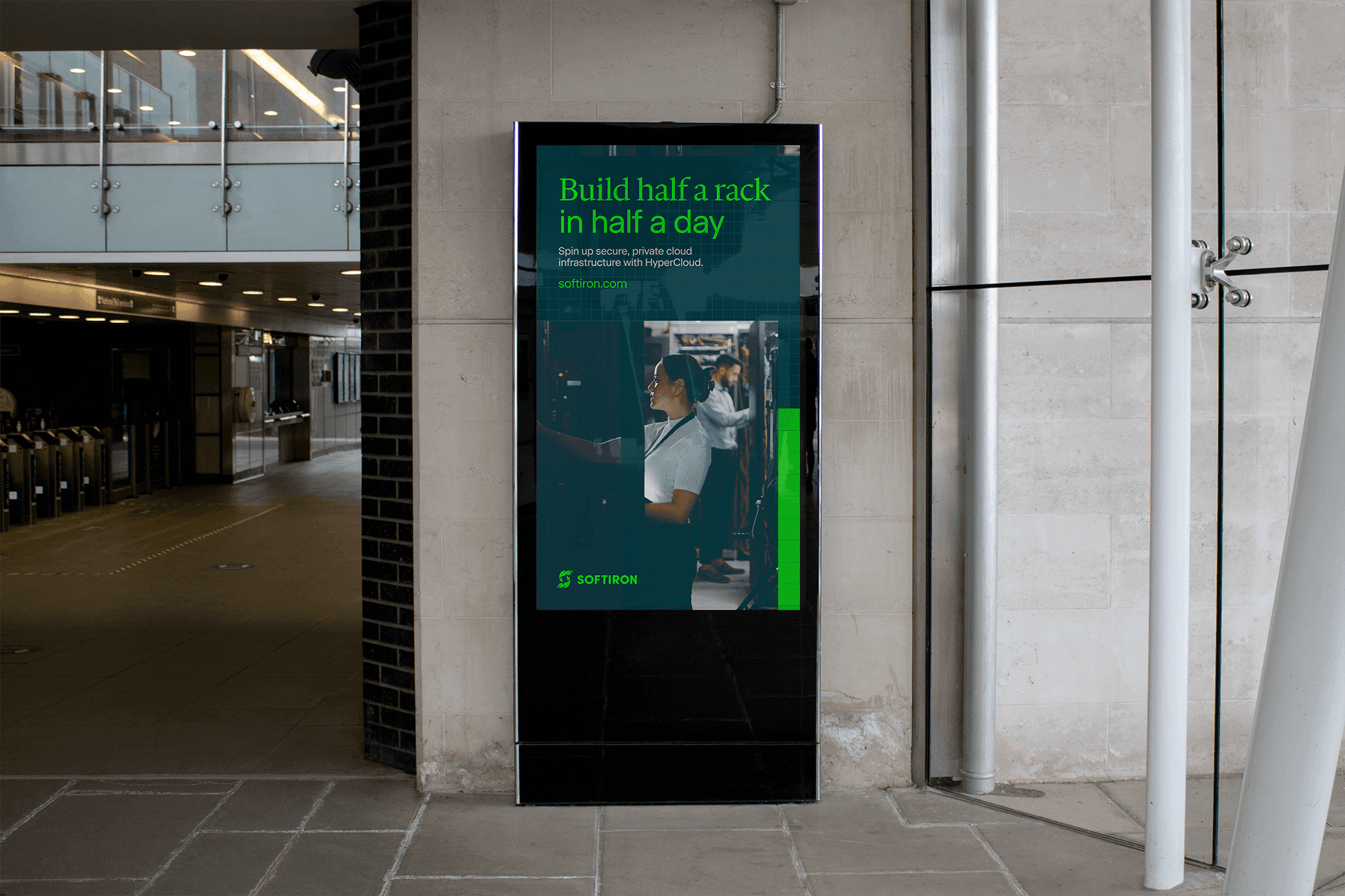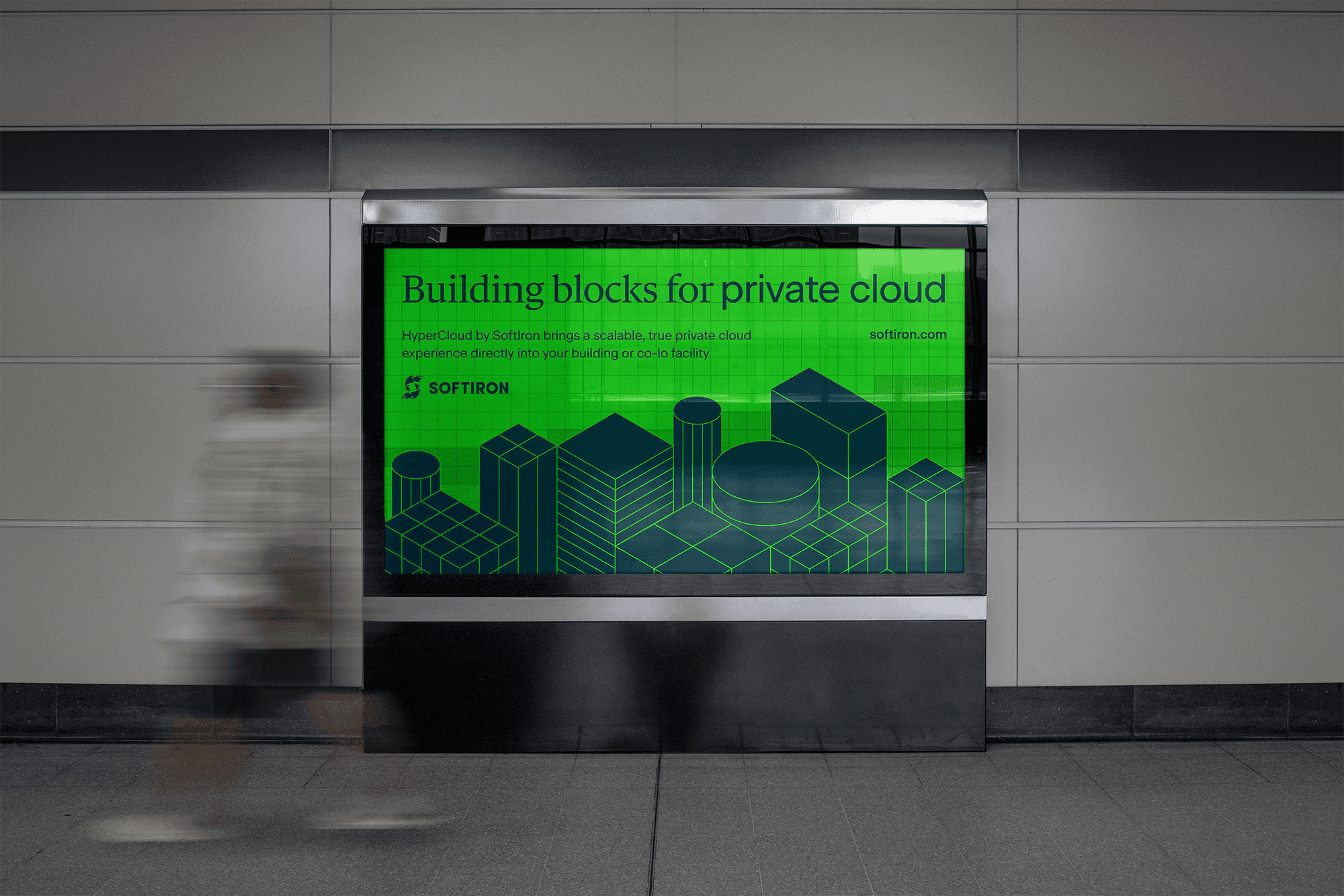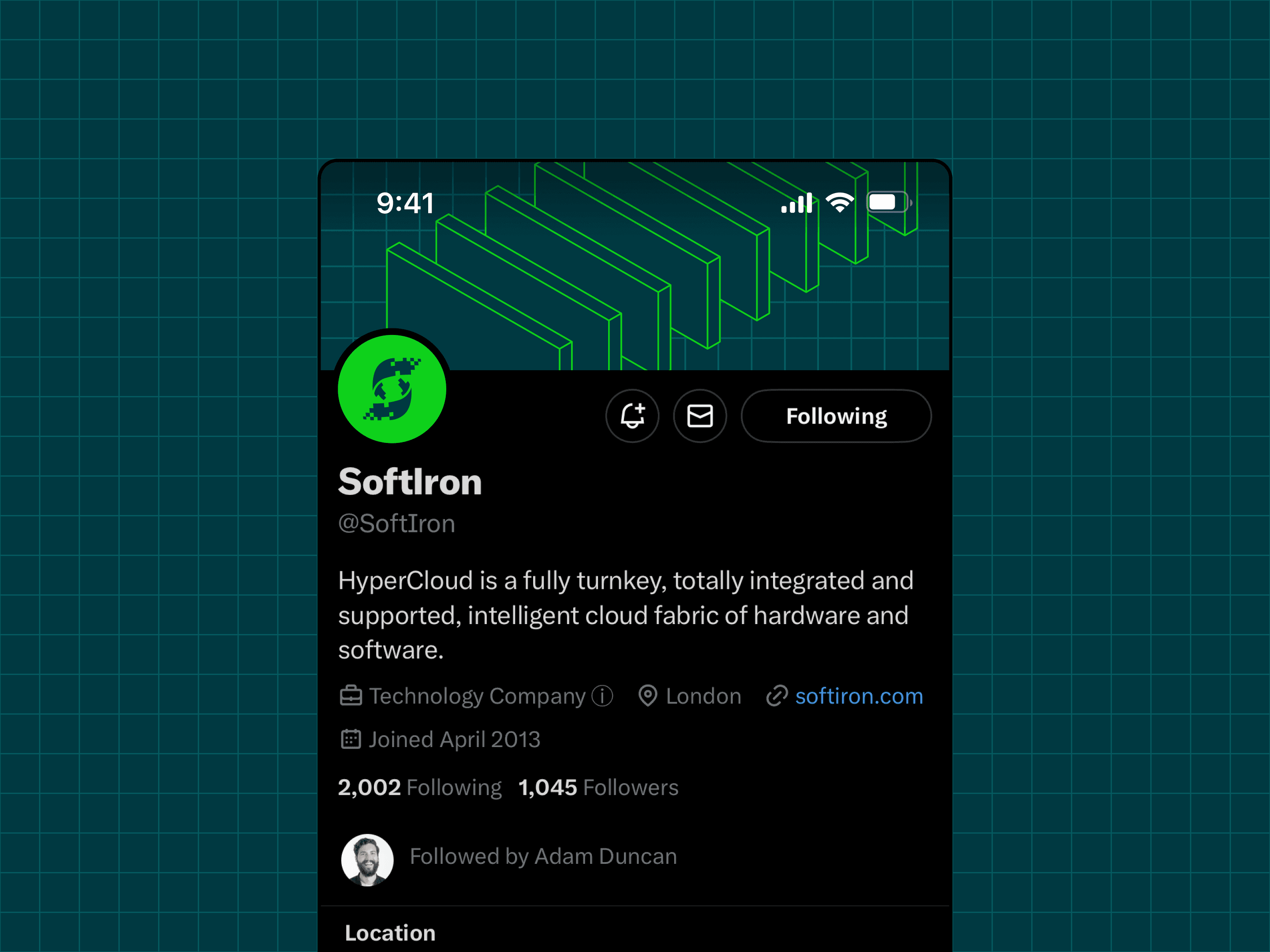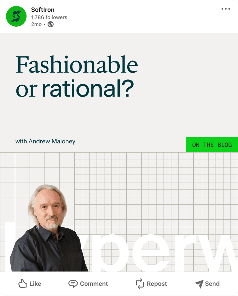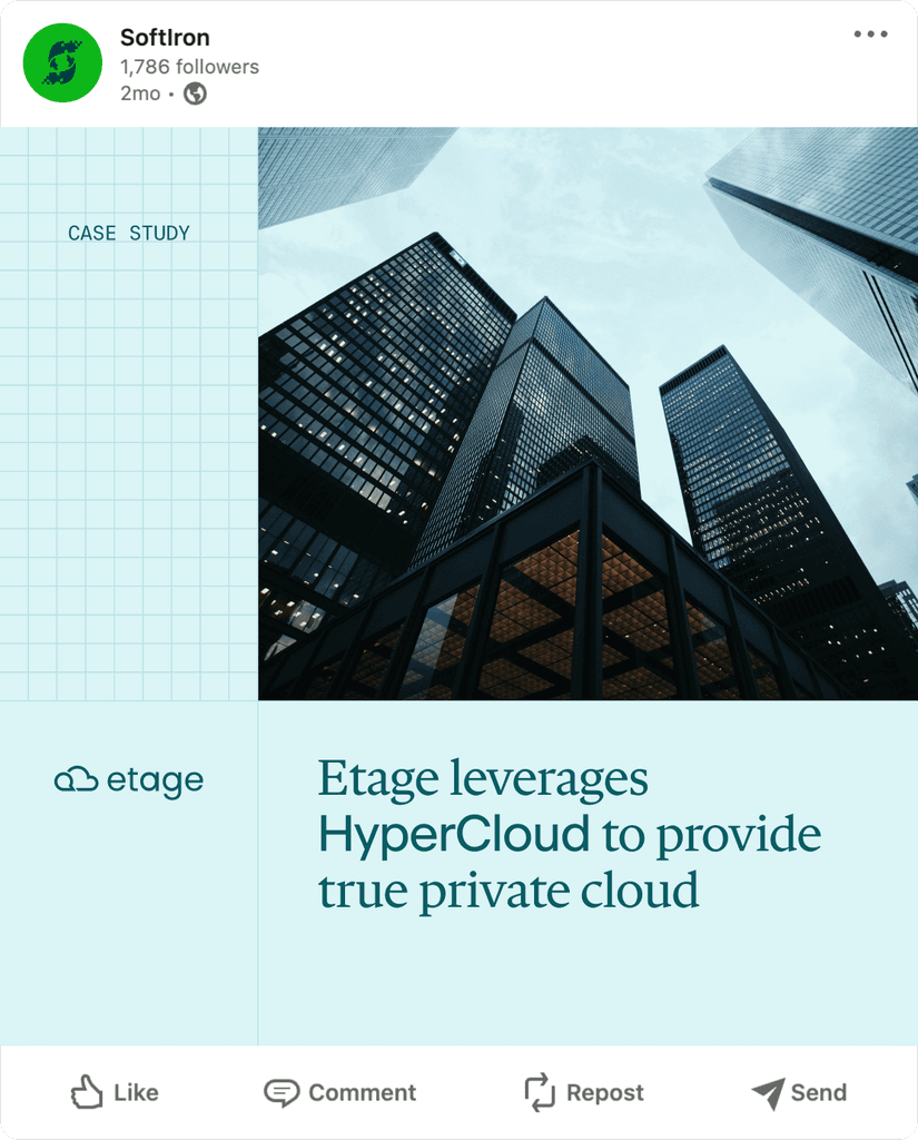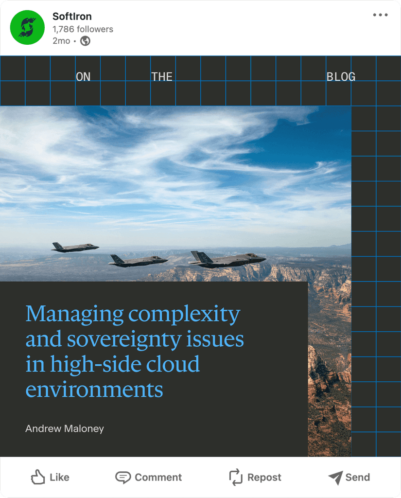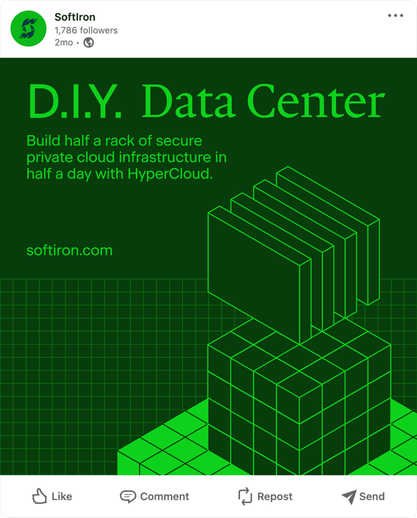
The brand’s visual language originated from the company’s pragmatism, adaptability and craft values. The base grid element that appears on just about every piece of communication, is a reference to schematics, city grids and circuit boards. These are all factors of the SoftIron business, who proudly design and build their products from scratch, and sell them as private cloud solutions to businesses, operating on premises of all shapes and sizes.
A set of modular isometric building blocks bring depth to visual communications and again reference both the private cloud (buildings) and DIY modularity aspects of the offering.
What we did
Brand foundations
Brand identity
Brand guide
Packaging
Graphic design
Web design
UX/UI design
Design system
Team
Kristy Ford
Callum Jones
Josh Earle
Biscuit Studio
VISIT
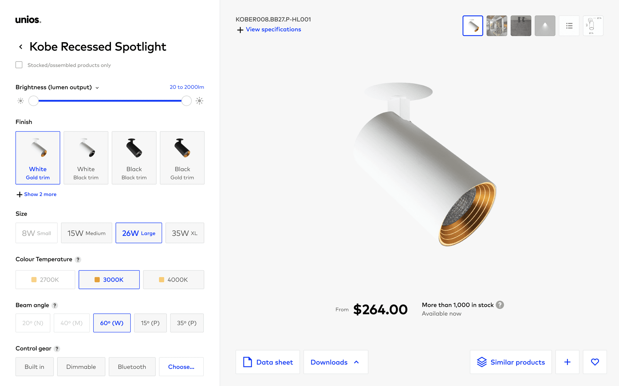
Recent years have seen Unios transform from challenger brand to tech-driven luminary leader. We worked with their brand and product teams to mature their digital offering to reflect this shift, and establish a digital brand system that connected with both customers in architectural industries, and the more pragmatic distributors and technicians.
Following insights from customer interactions, we redesigned website structures and flows to accomodate both the browsing and 'power-user' specifying experiences for key audience groups. Modular layout systems cater to a diverse array of content types, while rich imagery and interactions express the brand's more progressive and editorial nature.
Working closely with the product team, we crafted the foundations of a design system, creating consistency and efficiency for digital applications. With this system in the hands of an up-skilled brand team, the company can now produce and scale digital opportunities quickly and beautifully for years to come.
